

Role UX UI Designer
Timeline 80 hours
Tools used Figma, Photoshop, Illustrator
Company Background
Google was founded in 1998 by Larry Page and Sergey Brin who were 2 students. They originally created an internet search engine which could find information about any subject and eventually branched out into various other products like Gmail, Youtube, Android, Maps, and Translate to name a few. Google always tries to branch out into new categories, most recently health and gaming. Today, they have the largest search engine market shares and are one of the largest tech companies in the world.
Asthma users don’t have a good way to keep track of their medicine. They also don’t have great knowledge about their surroundings and whether a day is going to give them a lot of problems or not. Currently, much of this process is very manual and a few apps in here can track things manually but not automatically. Also, keeping in contact with a doctor along with the pharmacy is very manual so it would be great if there was a service where all of these pain points were addressed.
Project Goals
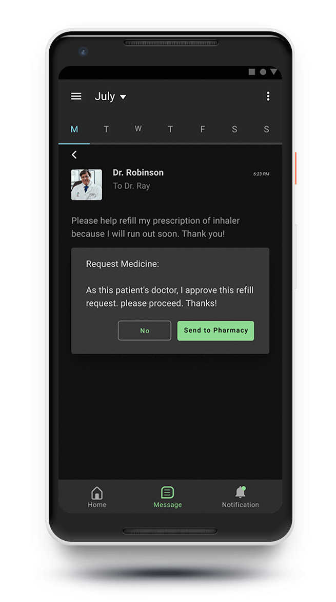
•Implement patient/doctor/pharmacy communication for prescription medicine refills
•Check symptoms for asthma as well as other diseases like COVID-19
•Create a trigger tracking page for asthma users to know when they have attacks
•Receive notifications regarding weather conditions which are sensitive to asthma like pollen levels, air quality, etc.
Design Process

EMPATHIZE
Competitor Analysis, Data Research, User research, Persona, StoryBoard
In order to find a solution to a problem, I have to understand why the user has a problem in the first place. Empathizing with them enables me to step into their shoes and discover their feelings, including struggles and behaviors. With this knowledge, it makes me more capable of developing an actual solution.
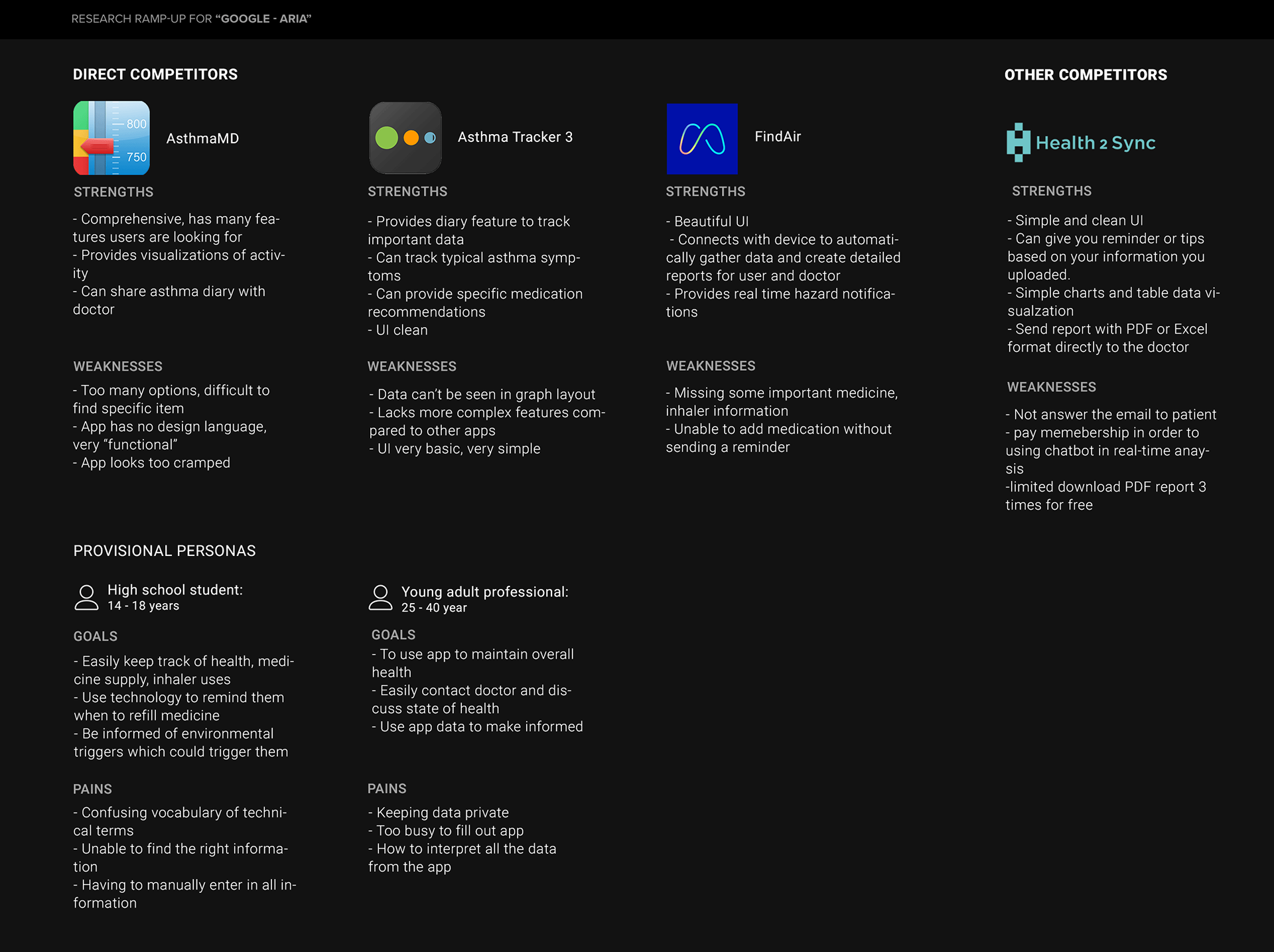
Competitor Analysis/Data Research:
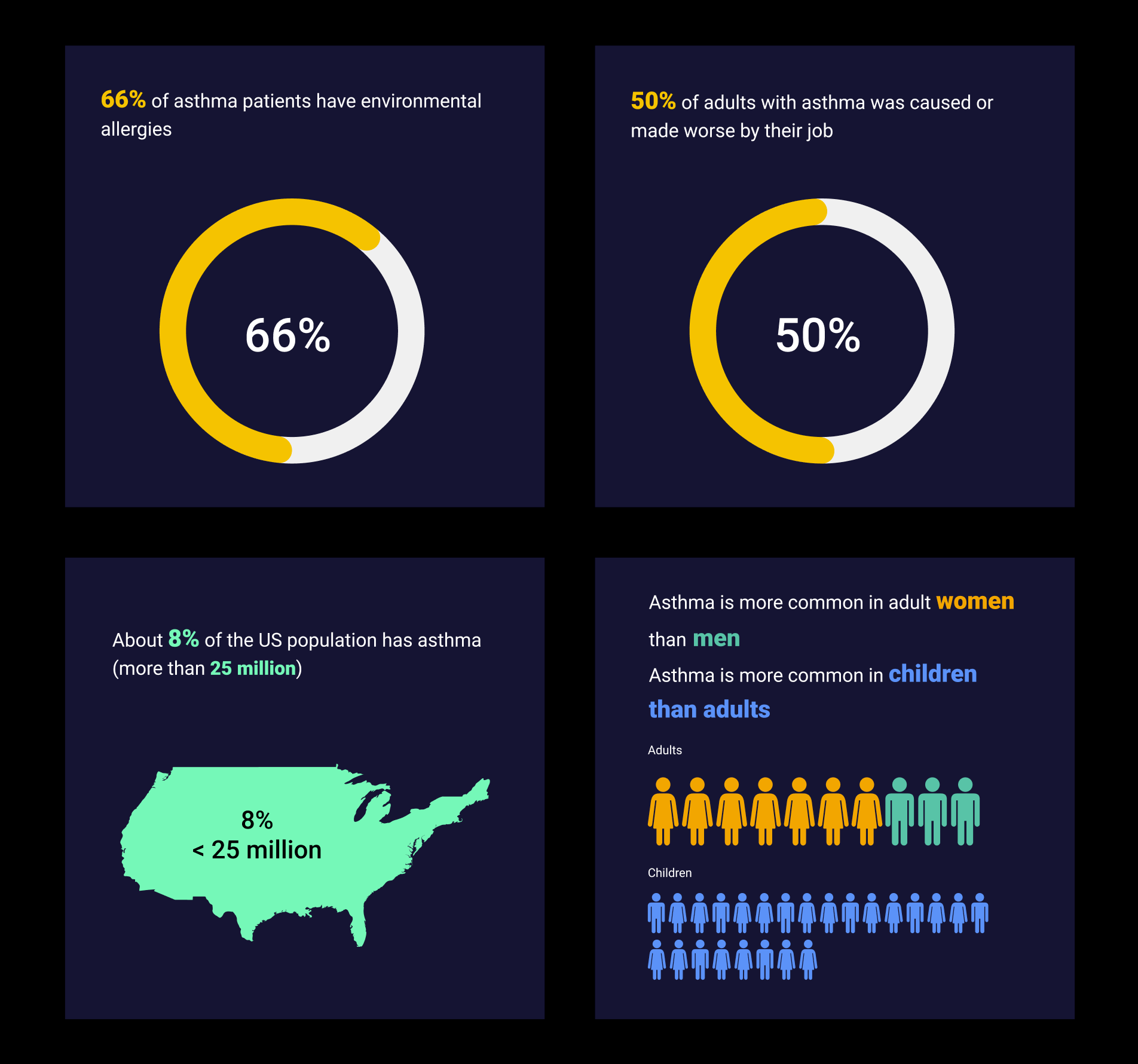
I had to do research to learn more about what is asthma. I also researched different apps on the Google Play to find which apps were popular which related to Asthma. After doing the research, I learned:
•About 8% of the US population has asthma (more than 25 million)
•Asthma is more common in adult women than men
•Asthma is more common in children than adults
•66% of asthma patients have environmental allergies
•50% of adults with asthma was caused or made worse by their job
Competitor Research
User Research
I prepared my questions to the participant which involves their daily life as well as external factors like weather. I want to know more about whether anything in their life caused their asthma as well as what they specifically look for in asthma.
Furthermore, I plan to ask them more about how they think an asthma app will help them in their daily lives. Based on my research, I realized that features where the user didn’t have to put in much work would be very important. So I focused my efforts on features which involved little involvement from the user.
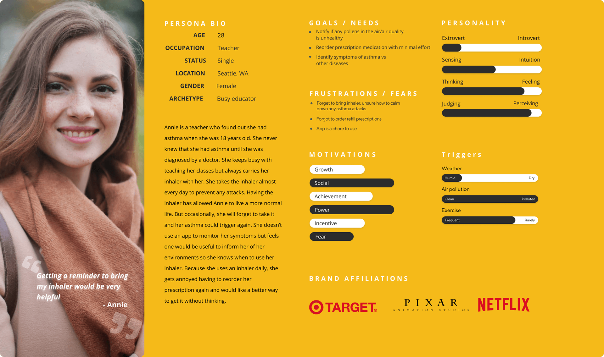
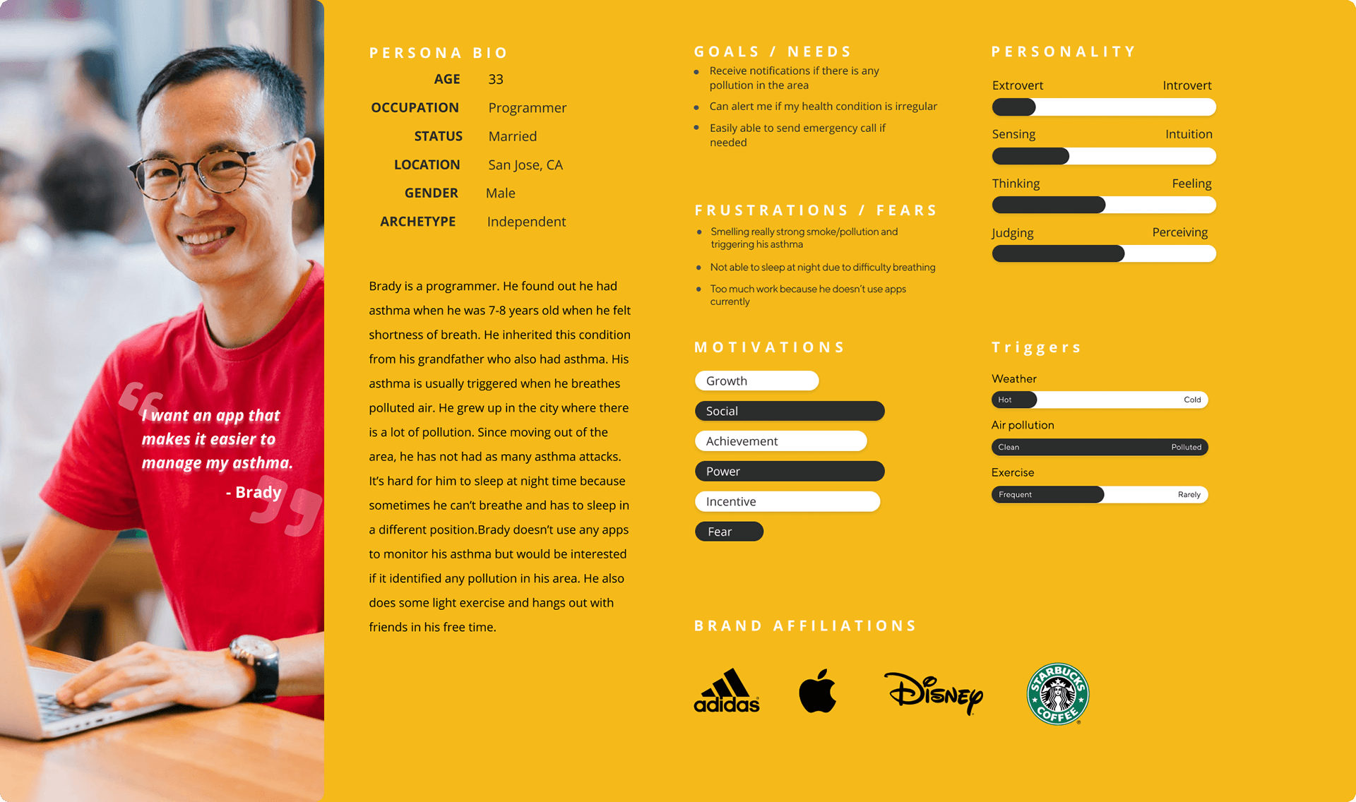
Persona
After completing my interviews and research, I used this information to create a persona, someone who embodies the typical user who would use the Aria app. It helps me understand their feelings, struggles, wants, and needs. It gives me a target of the type of person I need to solve the problems for.
I chose this persona because this type of user doesn’t want to forget bringing an inhaler and needs constant reminders. So providing reminders for anything else important would be a great value for the app to provide.
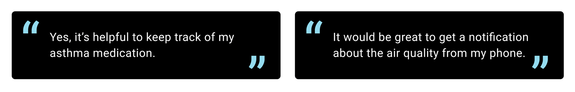
Key Findings About User Needs:
•Asthma users would like to find a way to better report the air quality around them which would trigger their asthma so they can be better prepared in case of an attack
•Asthma users want an easier method to be able to order/refill prescription medication easier
•Users see being able to track triggers as a nice to have, but not their highest priority
•Users liked the ability to determine whether they have a certain condition
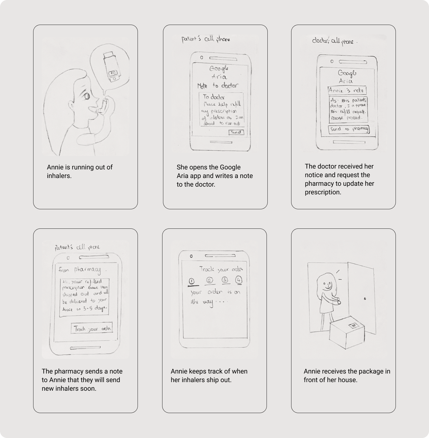
StoryBoard
The storyboard I created is what will map out what I expect the user experience to feel like when a person with asthma uses my app and how they expect the app to help them in their daily life. The storyboard will help qualify the pain points I indicated back in my problem statement.
DEFINE
Product Roadmap, Site Map, User Flow
Understanding the user’s struggles will enable me to define what the solution is. Defining the solution has taught me that functions and features users want in a high level so that I can implement them in my app design. I learned that defining the problem is critical to all the rest of the work you do. Otherwise, you will spend a bunch of time working on solutions to other problems.
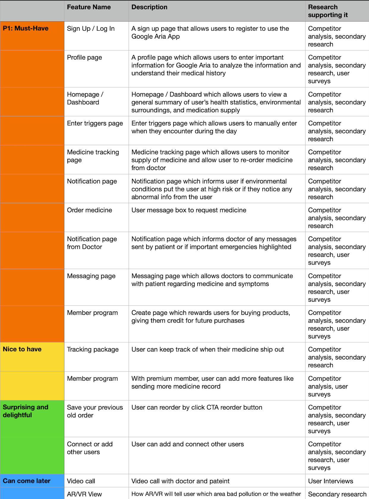
Product Roadmap
The product roadmap is basically the list of features that are a requirement or a nice to have. When I defined the most critical features, the roadmap showed me which features I have to focus my design on the most to address the user problems.
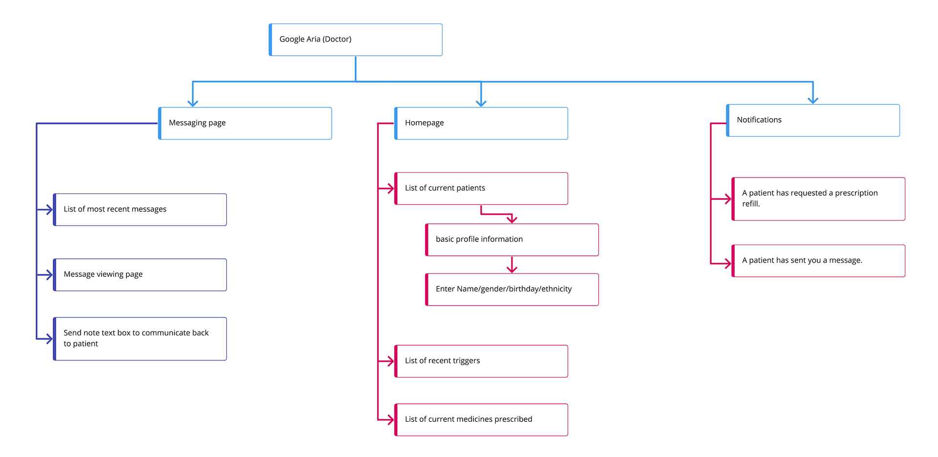
SiteMap
I drafted this sitemap in order to detail all the specific pages within the core home pages. It will also document the structure so when I work on the design later, I know which pages should connect together.
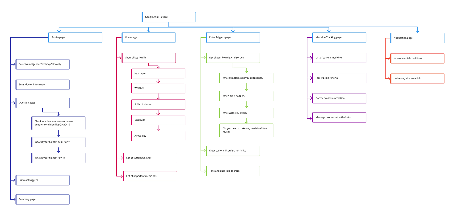
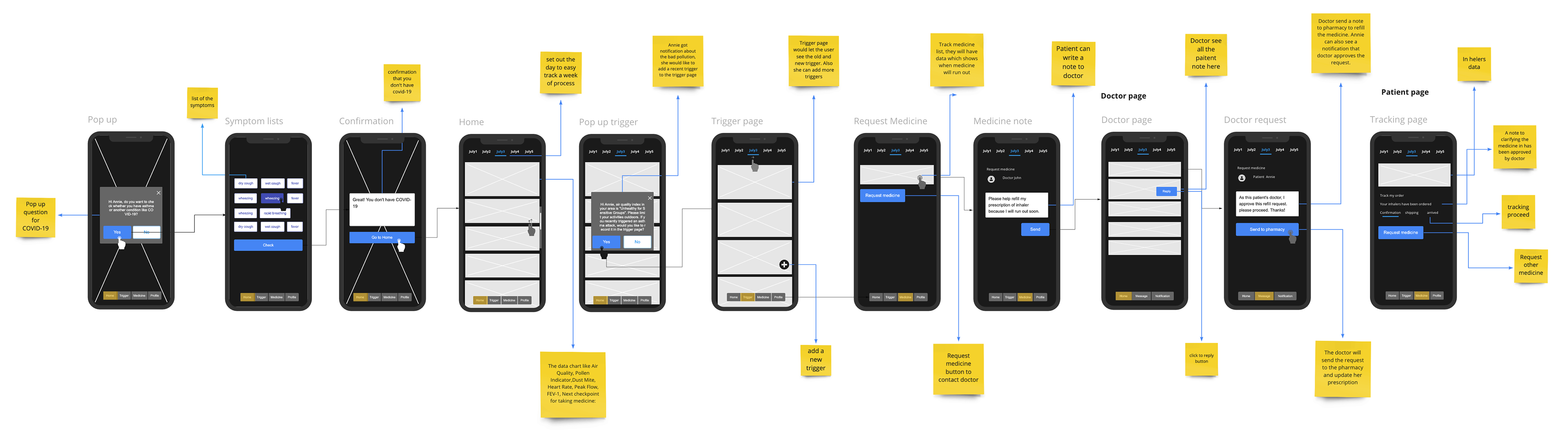
User Flow
After I structured the sitemap, the user flow page helps me determine how all of the different pages connect with each other. It also illustrates all points where the user has to make a decision which then tells the app which way to go like deciding to add a trigger or order medicine. It also has directions for the app to follow based on background tasks which the user is not aware of.

IDEATE
Brand Logo Design, Brand UI Kit, Mid-Fidelity Wireframes
As a designer, I will not come up with the best solution on my first try. To come up with a design, I have to ideate and create drafts of ideas just to see how I see a potential solution to the problem looks like. I learned that I shouldn’t try to rush coming up with the first idea and just try to create as many ideas as I can before evaluating.
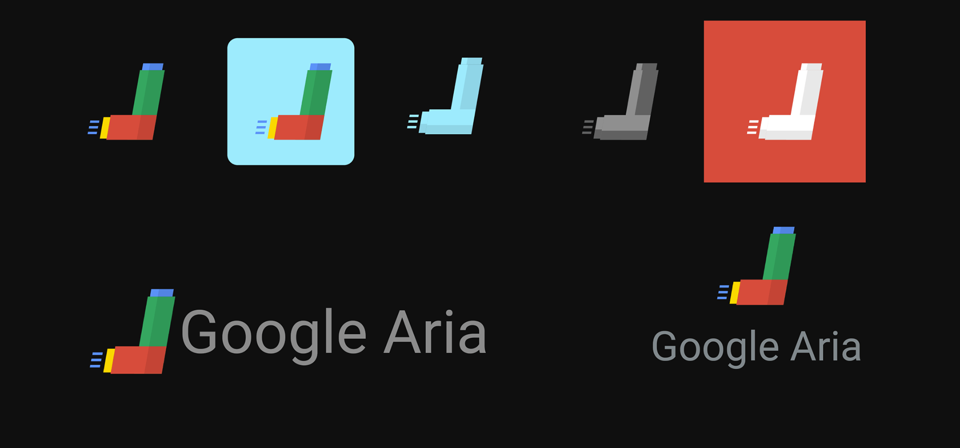
Brand Logo Design
I drew up a few concepts of the design, many of them related to breathing as well as using the typical Google colors. I also came up with concepts more related to the asthma inhaler. Some of my inspiration also came from looking at the other Google products icons. In the end, I chose the inhaler designs because it made more sense and was more simple.
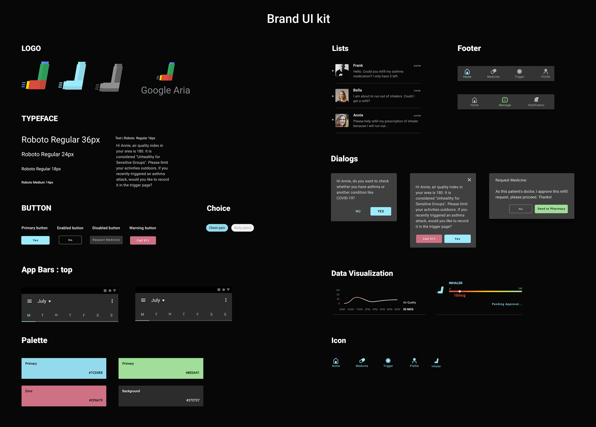
Brand UI Kit
Mid-Fidelity Wireframes
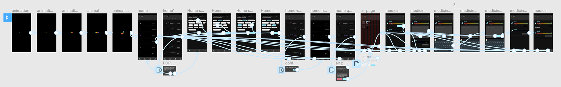
I used wireframes to brainstorm how I believed the flow of the app should be in order to achieve my project goals. They are very rough and don’t have any fine details like an actual prototype so I have a better understanding of rough positioning of page elements. Consider this a very low fidelity prototype.
PROTOTYPE
Patient/User Prototyping, Doctor/User Prototype
With the wireframe completed, then I started the more detailed high fidelity prototype. I researched a lot regarding Google’s material design in order to make sure I was following their design aesthetic. I also focused on using a lot of illustrations and modal pop ups to get the user’s attention instead of giving them a lot of text to read.
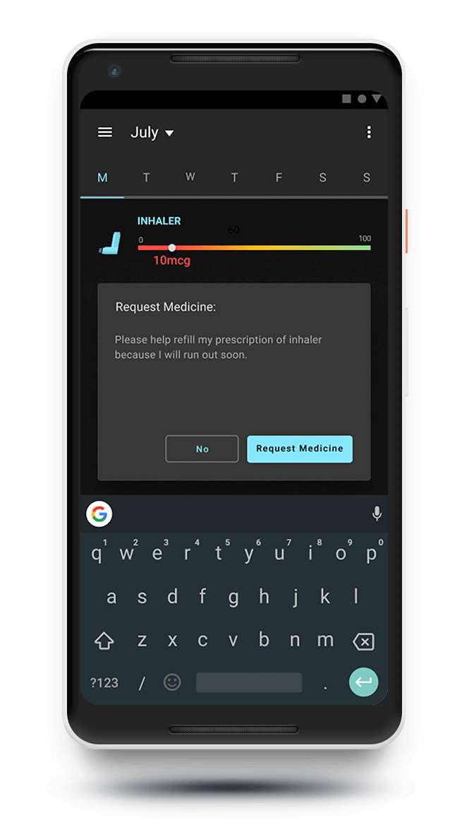
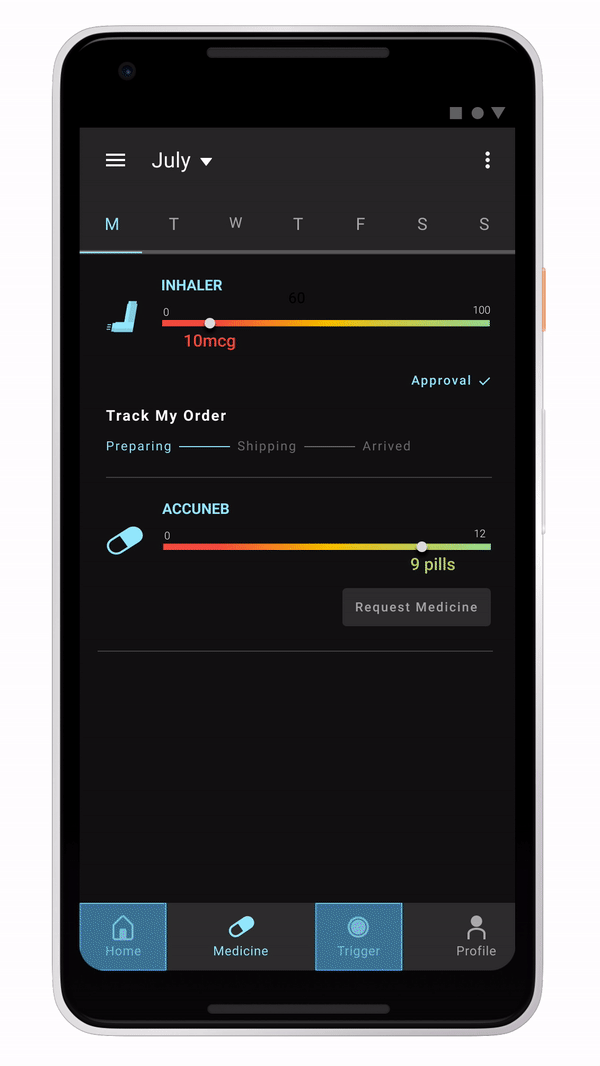
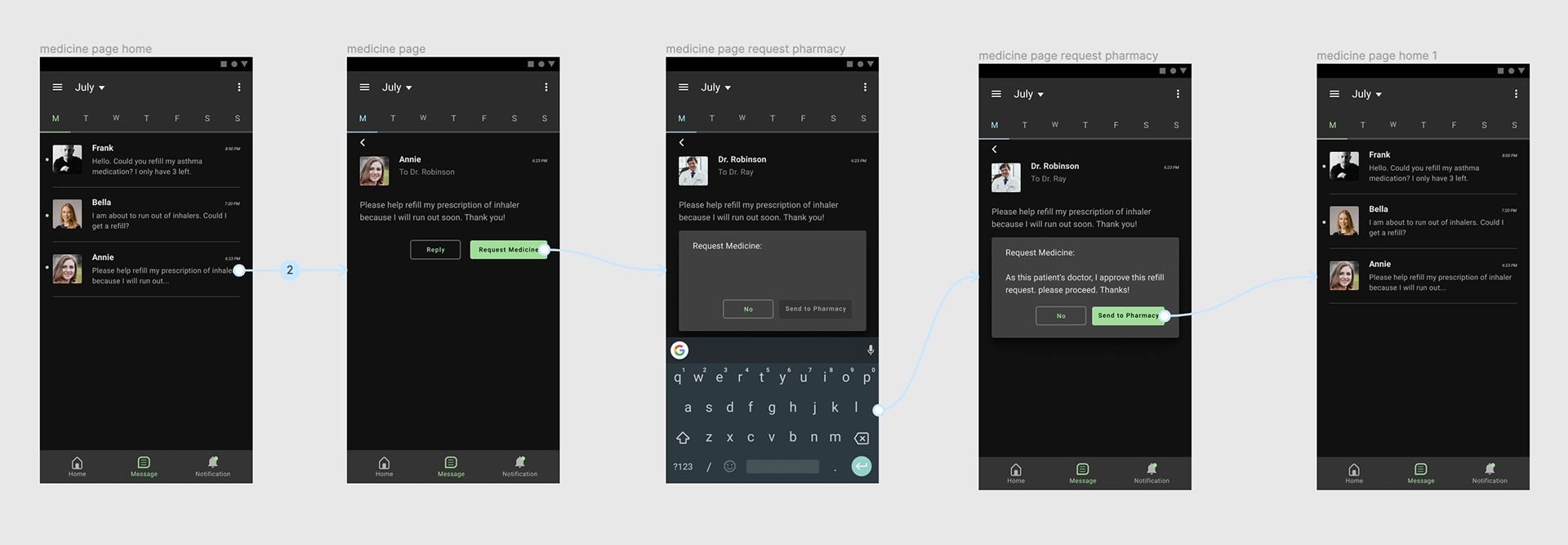
Patient/User Prototype
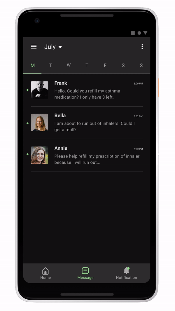
Doctor/User Prototype
TEST
Usability Testing, Usability Test Results, Affinity Map, Iterated Prototype
Usability Testing
After I completed the prototype, then came the user test. I handed my prototypes to users and observed the way they used the app. I also followed up with asking them questions about certain user interactions to see if they understood what I was trying to do. A lot of testing feedback will make sure that I will have to refine my design further.
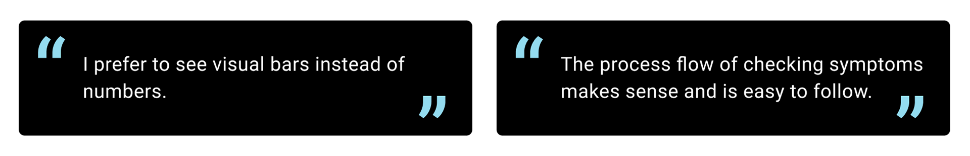
Usability Test Results
•Users recommended adding a way to escape the page when either adding a trigger or call 911.
•Change the medicine supply to a color bar instead of numbers
•Put the medicine tracking information under the specific item
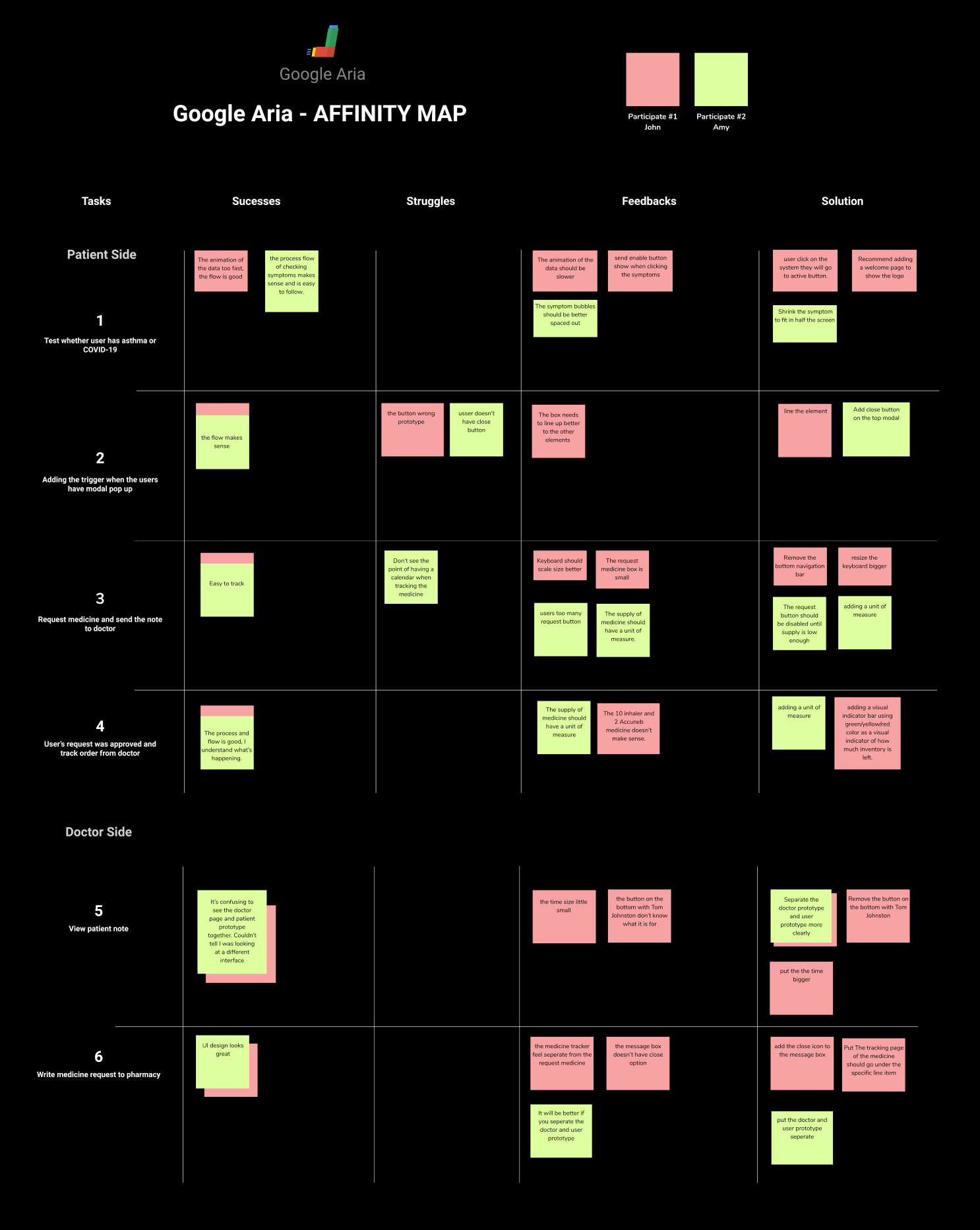
Affinity Map
After I completed my usability tests, I used an affinity map in order to visualize the success, struggles, and all the feedback I received from my test users. All of this information will be used to iterate and make an improved version of my app.
Iterated Prototype
Taking all the information from the user test results and affinity map, I updated my design making the improvements I thought were needed to make the design better and more usable. Testing and iterating is the way to refine the design to be the best version possible.
Conclusion:
I learned a lot while working on this project. It showed me a lot about how to create visualizations and follow design guidelines from another company. At the same time, it also taught me more about how to research subjects which you know nothing about. Because the topic was not something I new much about, it was really a lesson on what information I needed to know in order to work on the project correctly. Also, this project showed me the importance of user testing. I received a lot of feedback from user testing which in turn helped me refine my design to the final version I have. I wouldn’t have been able to do this if I just assumed what I did worked well.